Excel Project With Pivot Tables: Citi Bikes
This is a project that looks at the data from a company called Citi Bike. It is a bike rental company in New York City that allows clients
to pick-up a bike at one of its several locations and leave the bike at another location. The data can be found at Kaggle.com.


I determined the following using Excel's Pivot Tables:
1) the start locations frequented most and least
2) the end locations frequented most and least
3) use of service by age group
4) average duration of trip by age group
This info may help Citi Bike determine if some stations should be shut down or determine if more bikes should be placed at certain stations. Citi Bike may also use this information to target certain age groups and neighborhoods in its advertising.
The Excel spreadsheet was imported into Google Docs so that a link to the worksheet could be published here:
As a Google worksheet, the Pivot Table functionality is lost.
After making the table look cleaner with centered columns and bolded column headers, a Month column was added to convert the Month No. column into a word that is better understood in a chart. That was done using the IF function.
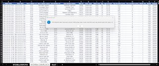
The data was then cleaned. The steps to clean the data were as follows (click on image to enlarge it):
1) The duplicate rows were removed. Excel found 3553 duplicate rows.

2) Search for blank cells...
This was done twice to ensure that blank cells weren't missed.
Only 1 blank cell was found, at row 3871, in the End Station Name column. It was decided to fill the cell with Newark Ave. because its address matched the address of the row above it.
3) Pivot tables were created to determine the 6 items given at the top of this post:
a) the Start Stations frequented most from January to March, 2017:

b) the Start Stations frequented least from January to March, 2017:

c) the End Stations frequented most from January to March, 2017 :

d) the End Stations frequented least from January to March, 2017:

Notice that the 3 Start Stations least used are also among the 10 End Stations least used.
e) use of service by age group from January to March, 2017:

A 3D plot was produced so that it could be seen that the 18-24 and 75+ were actually present in the plot. For curiosity, the same plot was produced but broken down into the 3 months.

As could be expected, the 75+ group had a low frequency of use, as people of that age may be less inclined to cycle due to effects of ageing. The 18-24 group, however, had the lowest frequency of use. This may be due to the members of that group owning their own bikes, as younger people are apt to do. Also, March had the highest number of trips for all groups, which may be a result of March's warmer weather being more conducive to cycling.
f) average duration of trip by age group from January to March, 2017:

As could be expected, the 75+ group had the highest average duration for a trip. This may be due to effects of ageing.
Comments
Post a Comment